OUR MISSION
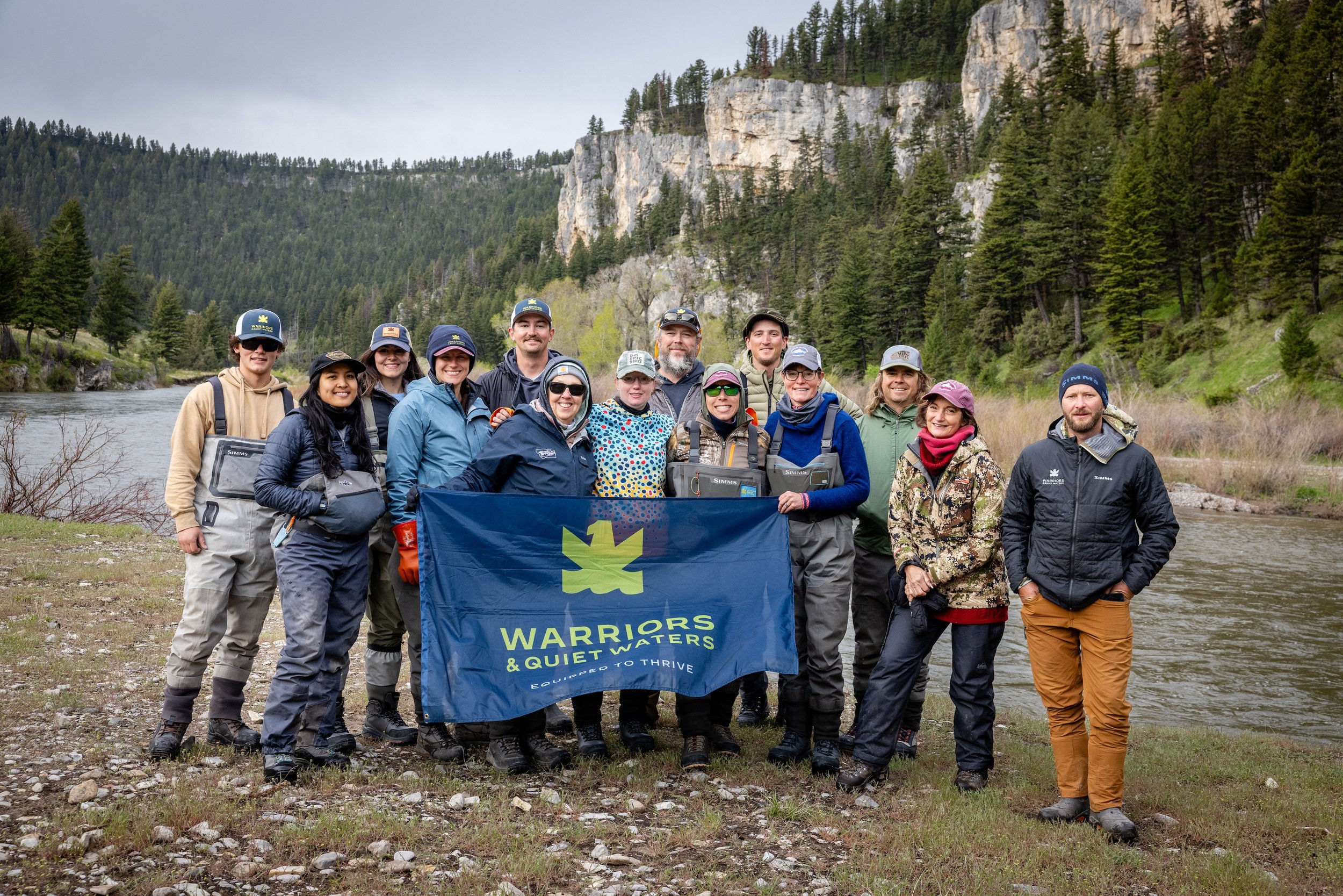
Warriors & Quiet Waters empowers post-9/11 combat veterans and their loved ones to thrive and live purpose-driven lives through peak experiences in nature and evidence-based programs that foster growth, discovery, connection, and community.
OUR COMMITMENT
we are constantly STRIVING
Our commitment never wavers. But as the world, tools, best practices, and needs of veterans change, we adapt, expand, and answer the call.

EQUIPPED TO THRIVE
OUR PURPOSE
OUR MISSION
Warriors & Quiet Waters empowers post-9/11 combat veterans and their loved ones to thrive and live purpose-driven lives through peak experiences in nature and evidence-based programs that foster growth, discovery, connection, and community.
OUR VISION
To unleash thriving veterans who Make America Stronger and inspire future generations to serve.
OUR VALUES
-
Our commitment to those we serve.
-
We are interdependent; we rely on each other to achieve a common mission greater than ourselves. Teamwork is our commitment to each other and the foundation of our approach to problem solving and pursuing opportunities.
-
The foundation of our decision-making and actions.
-
The foundation of the relationships that make our work possible.
-
Our essential tool to enable growth, purpose, resiliency, and well-being.
-
That enables our relentless and never-ending pursuit of excellence.
-
A conviction that generosity and fundraising are critical to organizational health and that everyone has a role in the process. Guides our approach to changing donor mindsets from “I have to give” to “I get to give”.
OUR PURPOSE
OUR MISSION
Warriors & Quiet Waters empowers post-9/11 combat veterans and their loved ones to thrive and live purpose-driven lives through peak experiences in nature and evidence-based programs that foster growth, discovery, connection, and community.
OUR VISION
We unleash thriving veterans that Make America Stronger and inspire future generations to serve.
OUR VALUES
-
Our commitment to those we serve.
-
We are interdependent; we rely on each other to achieve a common mission greater than ourselves. Teamwork is our commitment to each other and the foundation of our approach to problem solving and pursuing opportunities.
-
The foundation of our decision-making and actions.
-
The foundation of the relationships that make our work possible.
-
Our essential tool to enable growth, purpose, resiliency, and well-being.
-
That enables our relentless and never-ending pursuit of excellence.
-
A conviction that generosity and fundraising are critical to organizational health and that everyone has a role in the process. Guides our approach to changing donor mindsets from “I have to give” to “I get to give”.
OUR VALUE
TRANSFORMING COMBAT VETERANS. ONE PROGRAM AT A TIME.
At Warriors & Quiet Waters, we're just as passionate about helping veterans thrive after service as you are. That's why we created the Built for More Program - to empower combat veterans to rediscover purpose, rebuild trust, and reclaim a sense of mission that lasts a lifetime. Because thriving veterans make America stronger.


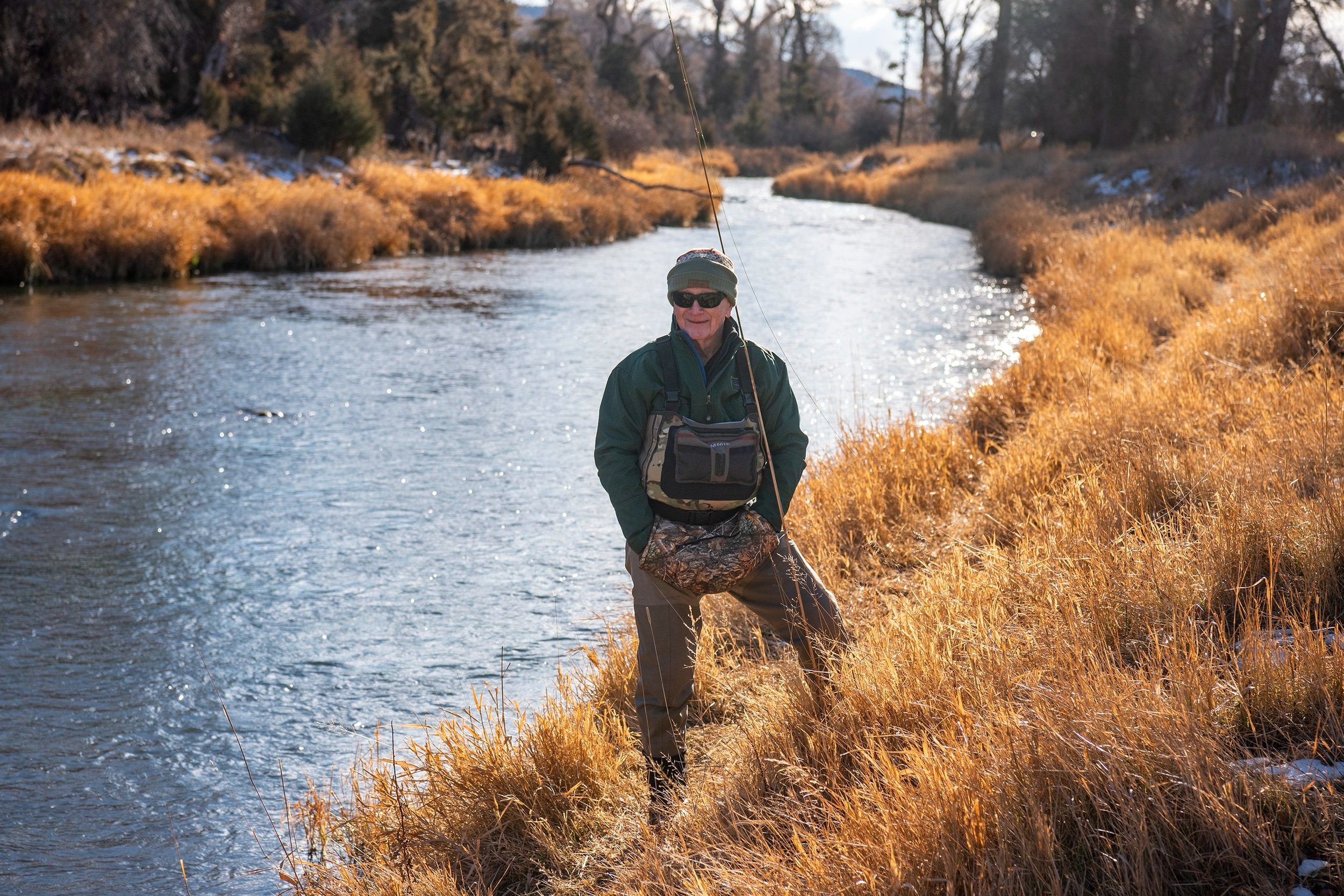
“After four years of Marine Corps aviation combat preparations, followed by a war in Vietnam, I found myself in desperate need of serenity and joy. It is no exaggeration to say that fly fishing helped save my life post-war.”
USMC Col. Eric Hastings, Founder, Warriors & Quiet Waters
OUR HISTORY
2007
it began on the water
Over his 34-year tenure with the Marines, Col. Eric Hastings restored himself each year with the deep peace of fly-fishing. In 2006, with two sons on active duty, Eric and his wife Jean hatched an idea over their fly rods: grant post-9/11 combat veterans the healing and perspective of fly-fishing.
Jean donated the first $10,000 and volunteered as “Mom,” cooking meals for the inaugural attendees. Along with a small army of volunteers and experts, the Hastings launched the first Warriors & Quiet Waters Solo Fishing Experience in July 2007.

2020
Pivotal moments matured into guided journeys
13 years in, WQW had delivered fly fishing experiences, respite, and community for around 1,000 Warriors—and they were asking for more. More guidance, more transformation, more opportunities to grow.
So, we dove into peer-reviewed research on positive psychology, holistic wellness, and the physiological and psychological benefits of immersive nature experiences. We worked with—and in some cases, partnered with—experts in these fields. We consulted with our veteran alumni, our volunteers, and our donors. And, of course, we mined our 13 years of working closely with veterans to tailor the program.
Within 18 months, we’d developed an immersive online personal growth component for our program, designed to build lasting change over 6 to 12 months. We also expanded our recreational opportunities to include archery hunting and photography. To celebrate, we launched a whole new brand.
By 2023, our first cohorts graduated from the new, visionary, and change-provoking Built for More program—and the results were profound.

2025
Unleashing thriving veterans on our nation
Since 2007, the Hastings’ vision has proven itself repeatedly. Because veterans are so driven to serve, we find that investing in one veteran also invests in a family, a community, a workplace, our own Warrior network, and ultimately, our nation.
As such, our goal remains quality over quantity, investing deeply into each participant so that they can invest outward.
What’s next? More programs are integrating into the Built for More framework. We’ll expand our facilities, branch out into new recreational outlets and locations, “trim the fat” to focus on impact, and build capacity to serve more Warriors, and expand our network of supporters.

MAKE YOUR MARK
You’re our history - And our future
Thanks to generous donor support, we were able to establish the Built for More program and make an even greater impact on the lives of our post-9/11 combat veterans and their loved ones.
Your continued support is essential so we can continue refining and expanding our programs.
